I am all about saving my users clicks these days. Developers love APEX for its low code framework. We can be up and running with a pretty great app in hours, and that’s something to celebrate!
But I believe that we need to invest a teeny bit of that time back into our apps and make sure we are giving our users the best experience possible. Whether it’s giving them a Mega Menu, actionable Cards, or visual cues such as Progress Bars, I love giving users more bang for their bucks, or rather, more bang for their clicks.
I use Bootstrap Popovers in many of my apps as a way of extending classic or interactive reports. Rather than forcing a user to click through to a detail page, I’ll serve them the information they are likely to need right there in a hover popover.
It’s really super easy to do, here’s how!
1. JS and CSS files
Don’t worry, we’ve got you covered! Many thanks to Bartosz Ostrowski for providing a Bootstrap CSS file that had only the necessary classes for the popover in his post here.
Download bootstrap.css, bootstrap.js and apex_popover.js here. The apex_popover.js file contains the functions to initialize the popover functionality. I have had these functions for years, and there might be a better way to do this! They allow you to trigger a popover off a span, a, img or button tag.
2. Upload all 3 files to Shared Components
Upload the 3 files you just downloaded to your Shared Components, Static Application Files.
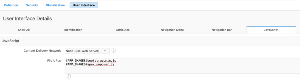
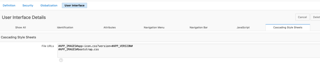
3. Reference the files in your User Attributes
Edit Application Properties –> User Interface –> Desktop
4. Write a query that includes your popover content
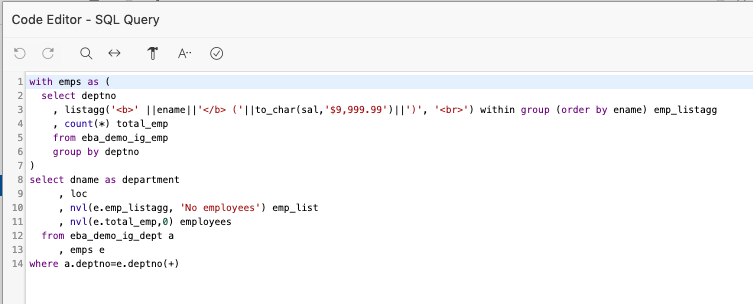
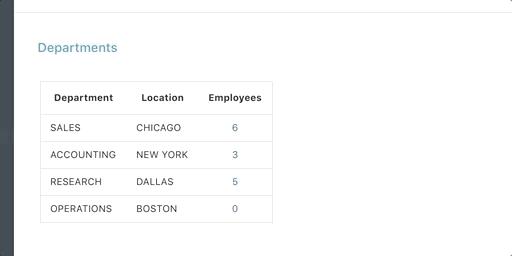
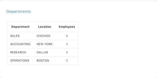
Basically, this query lists the departments and counts the employees within each department.
The emp_list column is a ‘<br>’ delimited list of employees in each department.
5. Use the HTML Expression attribute to render your popover
Edit the attributes of the column you want to trigger the popover. Go to HTML attributes and update as follows:
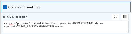
data-title is what displays in the popover title
data-content is the body of the popover, which we defined in our query earlier.

Feel like you want to play with the look and feel? Just launch your Theme Roller, and change up the properties of popover-title and popover-content!
6. Tweak your CSS (optional)
Add a bit of Custom CSS to the inline CSS section of your page, or open up Theme Roller, and pop in some custom CSS for the two classes below.
/* Popover Header */
.popover-title {
background-color: #006fd0;
color: #FFFFFF;
font-size: 28px;
text-align:center;
}
/* Popover Body */
.popover-content {
background-color: #979ca6;
color: #FFFFFF;
padding: 25px;
}
And that’s all there is to it! Hope you found it useful. Huge thanks to Jorge Rimblas who alerted to me to a potential security flaw in the first iteration of this post.
We also learned that there is some good security built in to the Bootstrap Popover natively, so while it does render HTML if you include it in your data-content tag, it will escape any javascript. XSS attacks are therefore mitigated. If you are interested in learning more about this library, you can refer to the documentation here.
As always, APEXionately yours,
Michelle
Download the code from this example, and install it in your environment (20.1) If you have already installed the Sample Interactive Grid application, you do not need the Supporting Objects!


Thanks Michelle – very helpful.
Can you make this work in Interactive Grid as well?